Thursday, January 22, 2015

Microsoft HoloLens


It’s the end of October, when the days have already grown short in Redmond, Washington, and gray sheets of rain are just beginning to let up. In several months, Microsoft will unveil its most ambitious undertaking in years, a head-mounted holographic computer called Project HoloLens. But at this point, even most people at Microsoft have never heard of it. I walk through the large atrium of Microsoft’s Studio C to meet its chief inventor, Alex Kipman.

The headset is still a prototype being developed under the codename Project Baraboo, or sometimes just “B.” Kipman, with shoulder-length hair and severely cropped bangs, is a nervous inventor, shifting from one red Converse All-Star to the other. Nervous, because he’s been working on this pair of holographic goggles for five years. No, even longer. Seven years, if you go back to the idea he first pitched to Microsoft, which became Kinect. When the motion-sensing Xbox accessory was released, just in time for the 2010 holidays, it became the fastest-selling consumer gaming device of all time. Right from the start, he makes it clear that Baraboo will make Kinect seem minor league.

Kipman leads me into a briefing room with a drop-down screen, plush couches, and a corner bar stocked with wine and soda (we abstain). He sits beside me, then stands, paces a bit, then sits down again. His wind-up is long. He gives me an abbreviated history of computing, speaking in complete paragraphs, with bushy, expressive eyebrows and saucer eyes that expand as he talks. The next era of computing, he explains, won’t be about that original digital universe. “It’s about the analog universe,” he says. “And the analog universe has a fundamentally different rule set.”
Translation: you used to compute on a screen, entering commands on a keyboard. Cyberspace was somewhere else. Computers responded to programs that detailed explicit commands. In the very near future, you’ll compute in the physical world, using voice and gesture to summon data and layer it atop physical objects. Computer programs will be able to digest so much data that they’ll be able to handle far more complex and nuanced situations. Cyberspace will be all around you.

What will this look like? Well, holograms.

First Impressions


That’s when I get my first look at Baraboo. Kipman cues a concept video in which a young woman wearing the slate gray headset moves through a series of scenarios, from collaborating with coworkers on a conference call to soaring, Oculus-style, over the Golden Gate Bridge. I watch the video, while Kipman watches me watch the video, while Microsoft’s public relations executives watch Kipman watch me watch the video. And the video is cool, but I’ve seen too much sci-fi for any of it to feel believable yet. I want to get my hands on the actual device. So Kipman pulls a box onto the couch. Gingerly, he lifts out a headset. “First toy of the day to show you,” he says, passing it to me to hold. “This is the actual industrial design.”

Oh Baraboo! It’s bigger and more substantial than Google Glass, but far less boxy than the Oculus Rift. If I were a betting woman, I’d say it probably looks something like the goggles made by Magic Leap, the mysterious Google-backed augmented reality startup that has $592 million in funding. But Magic Leap is not yet ready to unveil its device. Microsoft, on the other hand, plans to get Project HoloLens into the hands of developers by the spring.

Kipman’s prototype is amazing. It amplifies the special powers that Kinect introduced, using a small fraction of the energy. The depth camera has a field of vision that spans 120 by 120 degrees—far more than the original Kinect—so it can sense what your hands are doing even when they are nearly outstretched. Sensors flood the device with terabytes of data every second, all managed with an onboard CPU, GPU and first-of-its-kind HPU (holographic processing unit). Yet, Kipman points out, the computer doesn’t grow hot on your head, because the warm air is vented out through the sides. On the right side, buttons allow you to adjust the volume and to control the contrast of the hologram.


Microsoft’s Lorraine Bardeen demonstrates HoloLens at the Windows 10 event at the company’s headquarters in Redmond, Washington on Wednesday, Jan. 21, 2015.

Tricking Your Brain


Project HoloLens’ key achievement—realistic holograms—works by tricking your brain into seeing light as matter. “Ultimately, you know, you perceive the world because of light,” Kipman explains. “If I could magically turn the debugger on, we’d see photons bouncing throughout this world. Eventually they hit the back of your eyes, and through that, you reason about what the world is. You essentially hallucinate the world, or you see what your mind wants you to see.”

To create Project HoloLens’ images, light particles bounce around millions of times in the so-called light engine of the device. Then the photons enter the goggles’ two lenses, where they ricochet between layers of blue, green and red glass before they reach the back of your eye. “When you get the light to be at the exact angle,” Kipman tells me, “that’s where all the magic comes in.”

Thirty minutes later, after we’ve looked at another prototype and some more concept videos and talked about the importance of developers (you always have to talk about the importance of developers when launching a new product these days), I get to sample that magic. Kipman walks me across a courtyard and through the side door of a building that houses a secret basement lab. Each of the rooms has been outfitted as a scenario to test Project HoloLens.

A Quick Trip to Mars


The first is deceptively simple. I enter a makeshift living room, where wires jut from a hole in the wall where there should be a lightswitch. Tools are strewn on the West Elm sideboard just below it. Kipman hands me a HoloLens prototype and tells me to install the switch. After I put on the headset, an electrician pops up on a screen that floats directly in front of me. With a quick hand gesture I’m able to anchor the screen just to the left of the wires. The electrician is able to see exactly what I’m seeing. He draws a holographic circle around the voltage tester on the sideboard and instructs me to use it to check whether the wires are live. Once we establish that they aren’t, he walks me through the process of installing the switch, coaching me by sketching holographic arrows and diagrams on the wall in front of me. Five minutes later, I flip a switch, and the living room light turns on.

Another scenario lands me on a virtual Mars-scape. Kipman developed it in close collaboration with NASA rocket scientist Jeff Norris, who spent much of the first half of 2014 flying back and forth between Seattle and his Southern California home to help develop the scenario. With a quick upward gesture, I toggle from computer screens that monitor the Curiosity rover’s progress across the planet’s surface to the virtual experience of being on the planet. The ground is a parched, dusty sandstone, and so realistic that as I take a step, my legs begin to quiver. They don’t trust what my eyes are showing them. Behind me, the rover towers seven feet tall, its metal arm reaching out from its body like a tentacle. The sun shines brightly over the rover, creating short black shadows on the ground beneath its legs.


Microsoft

Norris joins me virtually, appearing as a three-dimensional human-shaped golden orb in the Mars-scape. (In reality, he’s in the room next door.) A dotted line extends from his eyes toward what he is looking at. “Check that out,” he says, and I squat down to see a rock shard up close. With an upward right-hand gesture, I bring up a series of controls. I choose the middle of three options, which drops a flag there, theoretically a signal to the rover to collect sediment.

After exploring Mars, I don’t want to remove the headset, which has provided a glimpse of a combination of computing tools that make the unimaginable feel real. NASA felt the same way. Norris will roll out Project HoloLens this summer so that agency scientists can use it to collaborate on a mission.

A Long Way Yet


Kipman’s voice eventually brings me back to Redmond. As I remove the goggles, he reminds me that it’s still early days for the project. This isn’t the kind of thing that will be, say, a holiday best seller. It’s a new interface, controlled by voice and gesture, and the controls have to work flawlessly before it will be commercially viable. I get that. I love voice controls, and I talk to Siri all the time. But half the time, she doesn’t give me a good answer and I have to pull up my keyboard to find what I’m looking for more quickly. Project HoloLens won’t have a keyboard. If the voice and gesture controls don’t work perfectly the first time, consumers will write it off. Quickly.

That said, there are no misfires during three other demos. I play a game in which a character jumps around a real room, collecting coins sprinkled atop a sofa and bouncing off springs placed on the floor. I sculpt a virtual toy (a fluorescent green snowman) that I can then produce with a 3-D printer. And I collaborate with a motorcycle designer Skyping in from Spain to paint a three-dimensional fender atop a physical prototype.

As I make my way through each, Kipman seems less nervous than when we began, but no less focused. It has been three hours since we met. In each scenario, he watches a screen that shows him what I am seeing, and he watches me trying to use his device for the first time. His eyebrows draw down in deep concentration as he checks to see if every calculation is perfect—noting the touch of my thumb and forefinger as I make an upward gesture, the words I reach for instinctively to instruct the computer. Seven years in, he is trying to see Project HoloLens as if for the first time. To see it through the eyes of a 30-something female New Yorker. But that is one thing his magical head-mounted holographic computer cannot do. At least not yet.

Project HoloLens: Our Exclusive Hands-On With Microsoft’s Holographic Goggles


Engineered bacteria kept in check with a designer diet

By Nature

Critics of genetic engineering have long worried about the risk of modified organisms escaping into the environment. A biological-containment strategy described this week in Nature has the potential to put some of those fears to rest and to pave the way for greater use of engineered organisms in areas such as agriculture, medicine and environmental clean-up.


Two US teams have produced genetically modified (GM) bacteria that depend on a protein building block — an amino acid — that does not occur in nature. The bacteria thrive in the laboratory, growing robustly as long as the unnatural amino acid is included in their diet. But several experiments involving 100 billion or more cells and lasting up to 20 days did not reveal a single microbe capable of surviving in the absence of the artificial supplement.

“Our strains, to the extent that we can test them, won’t escape,” says Dan Mandell, a synthetic biologist at Harvard Medical School in Boston, Massachusetts, and an author on one of the two studies describing the strategy.

The microbes also do not swap their engineered DNA with natural counterparts because they no longer speak life’s shared biochemical language. “Establishing safety and security from the get-go will really enable broad and open use of engineered organisms,” says Farren Isaacs, a synthetic biologist at Yale University in New Haven, Connecticut, who led the other study.

Biocontainment could provide added safety in the biological production of drugs or fuels, where microbes can be kept separate from their surroundings. But the modified bacteria could also permit controlled release into the human body or the environment. “Containment might no longer be of the physical kind,” says Tom Ellis, a synthetic biologist at Imperial College London who was not involved in the research.

The new technique originated in the laboratory of George Church, a geneticist at Harvard Medical School. Two years ago, Church and his team (which included Isaacs) reported the synthesis of a strain of Escherichia coli that had a reprogrammed genetic code. Instead of recognizing a particular DNA triplet known as the amber stop codon as an order to terminate protein synthesis, the recoded bacterium read the same instruction as a directive to incorporate a new kind of amino acid into its proteins.

Church and Isaacs have independently made this engineered microbe reliant on unnatural amino acids. The Isaacs team used genomic sequencing to identify sites in essential bacterial proteins where the microbes could incorporate synthetic amino acids without affecting overall function, whereas Church’s group started with the protein structures and added elements to help integrate and accommodate the artificial amino acids.

“This is really the culmination of a decade of work,” says Church.

These organisms are also more resistant to viruses than their natural counter­parts because of the mismatch between the genetic code of the virus and that of its host3. Looking ahead, Church and his team are working to co-opt seven different codons, instead of just one. “That would be more than enough to be resistant to all viruses and to create a lot of opportunity for safety,” Church says.

Isaacs has also developed a different safeguarding system, in which E. coli can grow only in environments containing synthetic chemicals needed for gene expression. He described the work this month in Nucleic Acids Research4. Another research team led by Jef Boeke at the New York University Langone Medical Center and Patrick Yizhi Cai at the University of Edinburgh, UK, has been working on a similar strategy in yeast. Commonly used in industry and biotechnology, yeast has its genetic mater­ial packaged in chromosomes similarly to animals and plants rather than bacteria.

“That’s a strategy that is going to be more easily adaptable to other organisms beyond E. coli,” says Isaacs. His team is now engineering a bacterium that is dependent on synthetic chemicals as well as on artificial protein building blocks. “I think ultimate solutions for robust biocontainment will involve multiple approaches that are deployed at the same time in a single organism,” he says.

Such a beast will present a real challenge for regulators, says Todd Kuiken, senior research associate for the Science and Technology Innovation Program at the Woodrow Wilson International Center for Scholars in Washington DC. “What we’re now starting to talk about is a really, completely synthetic organism,” Kuiken says. “How do you evaluate that once you put it out into the field?”

GM microbes created that can’t escape the lab

5 things that need to be fixed ASAP with Android 5.0


Google's Android 5.0 Lollipop release haslots of good things going for it -- but like many major OS releases at their start, the software also has its share of sigh-inducing quirks and glitches.

As Lollipop slowly makes its way to more devices, let's hope Google fixes these pressing issues sooner than later:

1. Memory management


I'm not the guy to pinpoint the source of the problem, but something's clearly amiss with memory management on Android 5.0. I first experienced it while reviewing the Nexus 9 and have since seen it (and read countless other users' reports of it) happening on other devices as well.

In short, Lollipop -- on some devices, at least -- seems to have trouble keeping processes running in active memory. As a result, you'll sometimes experience things like recently used apps "refreshing" and starting from scratch when you return to them, music-streaming apps like Google Play Music or Pandora randomly closing when they're running in the background, the home screen taking a moment to "redraw" itself when you return to it, and system-level actions like loading the Overview list acting less responsive than they should.

The fact that these things are now happening on multiple devices -- including both those designed for Lollipop and those that didn't have such issues prior to running Lollipop -- seems to indicate that it's a broader OS-level issue as opposed to anything limited to one particular set of hardware. And suffice it to say, that isn't a good thing.

2. Silent mode -- or lack thereof


Lollipop's new notification system is plenty powerful, but it's lacking one fundamental option: a simple way to set your phone to silent.

In past versions of Android, you could either just lower a device's volume all the way down or long-press the power button and use the direct shortcut there to activate silent mode. On Lollipop, lowering the volume all the way on a phone gets you to a vibrate-only state -- but there's no way to move from that to silent. And the power button shortcut is no longer present at all.

Instead, you have to first press your device's volume-up or volume-down key and then select the new "None" notifications setting -- which isn't at all intuitive and is going to confuse the hell out of most ordinary users. And on top of that, the "None" notifications setting prohibits even alarms from sounding, while a traditional silent mode does not.


The search for silent mode on Android 5.0

The only other option you have is to configure Lollipop's "Priority" notifications setting so that it'll allow alarms to sound but nothing else. That's an awful lot of work for something that should be so simple, though -- and again, it's something most ordinary users aren't going to figure out.

(On tablets,  you can still activate a silent mode by lowering the volume all the way until the device goes into vibrate-only and then pressing volume-up once from there.)

This may be less of a bug and more of an odd design decision -- but whatever you want to call it, it needs to be fixed.

3. Overloaded Overview


Lollipop's expanded approach to multitasking is one of those things that's great in theory but not quite there yet in reality. The basic idea is that the Overview button -- the command next to the Home button, also sometimes known as Recent Apps -- brings up a scrolling list of cards with all the processes you've used recently on your device. You can then jump directly to any of those tasks on demand, regardless of where you are in the system.

Part of that means that Overview no longer contains only apps, as it did in previous versions of Android; instead, it now splits apps apart into multiple steps, each is which is represented by a separate card. If you open Gmail and then start to compose a new message, for instance, you'll see a card in the Overview list for both Gmail itself and for the individual message.

The problem is that the Overview list quickly turns into an enormous mess of overlapping items that's more overwhelming than useful. No exaggeration: The Overview list on my Lollipop-running Moto X has 80 cards in it right now. Eighty cards! When I wasreviewing the Nexus 6, it had 60 cards in the Overview list at one point -- 22 of which were various instances of a Google search process. The Overview list never seems to clear itself, either, even when you turn the device off.


Dozens upon dozens of often-overlapping cards -- there has to be a better way

(As I noted in my review of the OS a couple months ago, you can swipe items away one by one to dismiss them -- but that isn't really a scalable solution, and you as the user shouldn't have to worry about playing custodian throughout the day.)

The new Overview list could be a wonderful thing. With its current implementation, though, its unmanageable nature acts as a source of frustration and severely limits its productivity potential.

4. Nonfunctional notifications


Lollipop introduces a new type of notification known as a "heads-up" notification. It's meant to provide a less distracting way for you to see pertinent information, but in reality, it often does just the opposite.

With the new "heads-up" notification system, alerts for things like incoming calls, text messages, and calendar events appear as floating cards at the top of your screen -- on top of whatever else you're viewing. You can either tap them to open them or swipe them away to dismiss them.


The issue with this is two-fold: First, the "heads-up" card shows you only a tiny snippet of message-oriented notifications and provides no way to expand them and view their full contents without switching over to the source app (e.g. Hangouts, Gmail, or whatever is sending the alert). That's a step backwards in functionality from the old Android notification system, in which incoming messages would appear in their entirety within the top-of-screen notification panel (using a subtle scrolling mechanism when needed).

And second, if you're in the middle of doing something else on your device and don't want to deal with an incoming "heads-up" notification right away -- butdo want to keep it around so you'll remember to deal with it later -- your only choice is to stop what you're doing and wait about 10 seconds until the card disappears on its own, at which point it'll move up into your notification panel as a regular alert. If you swipe the card away, the notification will get dismissed for good.

For the "heads-up" system to work, we need (a) a way to expand incoming notifications and view them in their entirety (similar to the way we can swipe down on normal notifications in the notification panel to do just that) and (b) a way to push incoming notifi

cations upward to get them off the screen but keep them available in the notification panel. The current system just doesn't cut it and frequently feels like a worse version of what we had before.

5. Lock screen oddities


Along with Lollipop's new notification system comes a revamped lock screen that shows your pending notifications and lets you deal with them right then and there.

That's convenient in theory, but the current implementation has a couple of irksome quirks. For one, if you use a security pattern, password, or PIN, the new lock screen requires you to take an extra step every time you want to unlock your device: You first have to swipe away the initial screen -- where any notifications are displayed along with a large clock -- before you can input your code. Even if you disable lock screen notifications altogether, you still have to swipe away the clock before you can get to the security prompt.

Given how often most of us unlock our devices, that extra step can get annoying fast -- and there's no reason that disabling lock screen notifications shouldn't alsodisable that superfluous initial screen.

Even with lock screen notifications disabled, you have to swipe away an initial screen (at left) before you can input your code (at right). Why not just put the clock above the security prompt?
Beyond that, the Lollipop lock screen has a weird behavior in which swiping upward unlocks the device -- which makes sense -- but swiping downward takes you to a full-screen view of your pending notifications (essentially the same thing you were already looking at, only without the clock). The latter is quite confusing, particularly since there are no visual cues to indicate that'll happen and the behavior itself doesn't seem to serve any purpose.

Déjà vu: When you swipe downward on the main lock screen (at left), you see a full-screen view of your notifications (at right)

On my initial moments with Lollipop -- even as someone who's used Android for ages and spends hours every day dealing with mobile devices -- it took me a few minutes of trial and error to figure out what was going on with the different lock screen swiping behaviors. I saw the same thing happen to several family members and friends when they first got Lollipop on their devices, too, only accompanied by even more confusion (along with a puzzled glance pointed in my direction).

A little tweaking would go a long way in simplifying and improving that user experience.
All things in


As we wrap up this list of quibbles, let's be clear about one thing: Lollipop represents a foundational shift for Android, and by and large, it's an enormous leap forward for the platform. From its gorgeous visual overhaul to its numerous new features, the software truly is the start of a whole new chapter for the operating system -- one that presents ample cause for optimism and excitement.

But it's very much a beginning -- and particularly now that we've had more time to live with Lollipop and experience it on a variety of devices, it's clear that Google still has some work left to fine-tune the software and iron out the kinks. The good news is that the issues are all perfectly solvable -- and in the grand scheme of things, they'll likely become mere bumps in the road of Android's evolution.

With any luck, that pavement will be smoothed out soon.

Broken Lollipop: 5 things that need to be fixed ASAP with Android 5.0

Friday, January 9, 2015


                                                                   By nature

A new computer algorithm can play one of the most popular variants of poker essentially perfectly. Its creators say that it is virtually “incapable of losing against any opponent in a fair game”.

This is a step beyond a computer program that can beat top human players, as IBM's chess-playing computer Deep Blue famously did in 1997 against Garry Kasparov, at the time the game's world champion. The poker program devised by computer scientist Michael Bowling and his colleagues at the University of Alberta in Edmonton, Canada, along with Finnish software developer Oskari Tammelin, plays perfectly, to all intents and purposes.

That means that this particular variant of poker, called heads-up limit hold’em (HULHE), can be considered solved. The algorithm is described in a paper inScience.

The strategy the authors have computed is so close to perfect “as to render pointless further work on this game”, says Eric Jackson, a computer-poker researcher based in Menlo Park, California.

“I think that it will come as a surprise to experts that a game this big has been solved this soon,” Jackson adds.

A few other popular games have been solved before. In particular, in 2007 a team from the same computer-science department at Alberta — including Neil Burch, a co-author of the latest study — cracked draughts, also known as checkers.

But poker is harder to solve than draughts. Chess and draughts are examples of perfect-information games, in which players have complete knowledge of all past events and of the present situation in a game. In poker, in contrast, there are some things a player does not know: most crucially, which cards the other player has been dealt. The class of games with imperfect information is especially interesting to economists and game theorists, because it includes practical problems such as finding optimal strategies for auctions and negotiations.

With regret

In poker, the main challenge is dealing with the immense number of possible ways that a game can be played. Bowling and colleagues have looked at one of the most popular forms, called Texas hold’em. With just two players, the game becomes heads-up, and it is a 'limit' game when it has fixed bet sizes and a fixed number of raises. There are 3.16 × 10¹⁷ states that HULHE can reach, and 3.19 × 10¹⁴ possible points at which a player must make a decision.

Bowling and colleagues designed their algorithm so that it would learn from experience, getting to its champion-level skills required playing more than 1,500 games. At the beginning, it made its decisions randomly, but then it updated itself by attaching a 'regret' value to each decision, depending on how poorly it fared.

This procedure, known as counterfactual regret minimization, has been widely adopted in the Annual Computer Poker Competition, which has run since 2006. But Bowling and colleagues have improved it by allowing the algorithm to re-evaluate decisions considered to be poor in earlier training rounds.

The other crucial innovation was the handling of the vast amounts of information that need to be stored to develop and use the strategy, which is of the order of 262 terabytes. This volume of data demands disk storage, which is slow to access. The researchers figured out a data-compression method that reduces the volume to a more manageable 11 terabytes and which adds only 5% to the computation time from the use of disk storage.

“I think the counterfactual regret algorithm is the major advance,” says computer scientist Jonathan Shapiro at the University of Manchester, UK. “But they have done several other very clever things to make this problem computationally feasible.”

Bluffing game

As part of its developing strategy, the computer learned to inject a certain dose of bluffing into its plays. Although bluffing seems like a very human, psychological element of the game, it is in fact part of game theory — and, typically, of computer poker. “Bluffing falls out of the mathematics of the game,” says Bowling, and you can calculate how often you should bluff to obtain best results.

Of course, no poker algorithm can be mathematically guaranteed to win every game, because the game involves a large element of chance based on the hand you’re dealt. But Bowling and his colleagues have demonstrated that their algorithm always wins in the long run.

The problem is only what the researchers call 'essentially solved', meaning that there is an extremely small margin by which, in theory, the computer might be beaten by skill rather than chance. But this margin is negligible in practice.

Bowling says that the approach might be useful in real-life situations when one has to make decisions with incomplete information — for example, for managing a portfolio of investments. The team is now focusing on applying their approach to medical decision-making, in collaboration with diabetes specialists.

Game theorists crack poker

Yesterday we showed you what was reported to be the first ever leaked screenshot showing an in-development build of Spartan, Microsoft’s upcoming Web browser for Windows 10 which was first rumored late last year. Today though there are a couple of new leaked images doing the rounds, and these two show us a very different design for Spartan.

That may be a good thing, given how cartoonish its interface looked in yesterday’s shot. The downside is that today’s leak is comprised of two extremely small and extremely blurry screenshots.

The actual leaked images are the first two below. Underneath you can see a mockup based on them, which is supposedly a near 1:1 replica of the browser’s UI.

An early view of Microsoft Spartan Browser For Windows 10


If you ask “certain” people, they’ll tell you that Android is inherently laggy (then again, if you don’t ask them, they’ll eventually volunteer that opinion anyway). In the past, generally speaking, Android hasn’t been “laggy” per se, the operating system just handles processes and priorities differently than others may. Put simply, as soon as you touch the screen of an iPhone or iPad all processing stops while the OS devotes its full attention to your interaction – at the expense of stopping everything else. This gives the impression of fluidity and speed, but in reality, processes take longer than they do using Android’s approach.

Android handles screen touches as just another event. All the processes currently running continue to run. If your device is underpowered or running a lot of “stuff” in the background, the perception might be interpreted as “laggy”, even though it’s finishing tasks faster than the competition does.

Be that as it may, this perceived “lag” seems to be more visible in Android 5.0 Lollipop than in previous versions of Android. While some blamed the new Material Design with all its new-fangled animations, others pointed to the encryption that defaults to “on” for the devices shipping with Lollipop. Others, however, started looking deeper, and submitted bug tickets to the Android Open Source Project Issue Tracker.

Finally a trend started to emerge. After around 40 hours of “on time”, lag started to crop up. “Weird” things started happening. Apps started to hang – and eventually crash. The good news? Everything was “fixed” with a simple reboot. Ah ha! The clue!

When things work for a while, and get progressively worse, and are resolved by a reboot, that’s typically an indicator of a memory leak. What’s a “memory leak”, you ask? Imagine that RAM is tea, and apps are tea cups. Every school girl will tell you that a proper tea set has several cups (what’s a tea party without a bunch of friends, right?).

this scenario, you fill the cups (which represent loading apps from storage into RAM), then wait. Instead of the cups being emptied by the guests, they miraculously keep filling with tea. Your guests look on in wondered amazement!

Eventually the cups get so full that the tea spills over the edge of the cups. You, being the gracious host that you are, spring into action, grab a towel, and mop up the spilled tea. Then another cup overflows, and another. Eventually the tablecloth is soaked. Your guests’ amusement at the self-filling teacups has turned to frustration and ruined clothing (they’ll be sending you a bill for that!). Your party is a mess – literally as well as figuratively.

In our scenario, the apps keep filling up more and more RAM. This forces other apps to hang and eventually close, until running even one app at a time becomes frustrating. Finally, something triggers a reboot and just like that, the tablecloth is replaced, a fresh pot of tea has been made, and your guests are eager to catch up on the daily news – until it starts happening again.

This appears to be the case with Android Lollipop. Luckily, the issue has been reported and it’s even been closed as “resolved!” Sure, it took six weeks for Google to identify and fix the problem, but that’s not too terribly bad – I guess.

What is bad is that the fix will deployed in a “FutureRelease”. Whether that means Android 5.0.3 or 5.1, or 6.x, who knows. Hopefully it will roll out quickly in 5.0.3 – whenever that arrives.

Might I interest you in a cup of tea while we wait?

Here’s why Android Lollipop is laggy

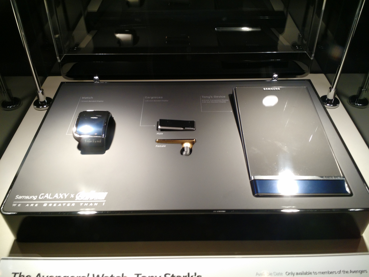
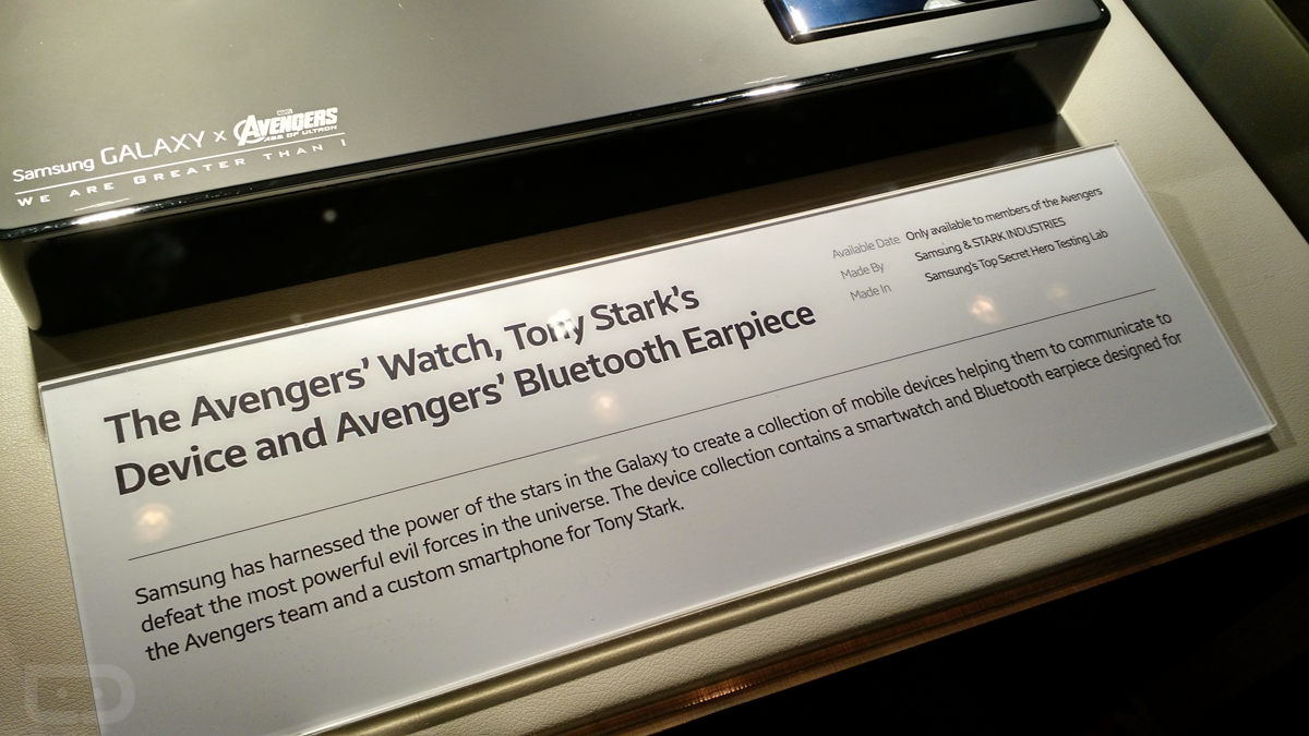
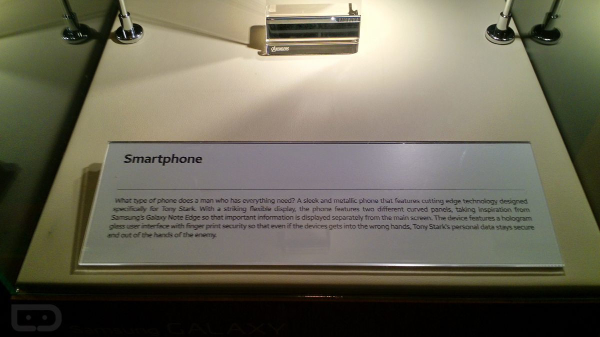
In mid-2014, Samsung and Marvel announced a global brand partnership that would allow the South Korean electronics manufacturer to showcase exclusive Marvel content, but also create cool concept tech for films, such as Avengers: Age of Ultron. As you all know, the new Avengers is going to be the movie to see in 2015, so Samsung is making sure we all know that they are a part of the action. 

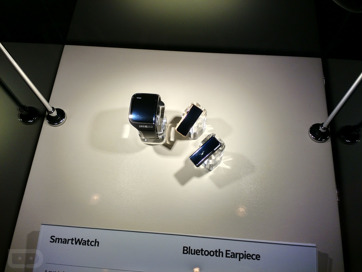
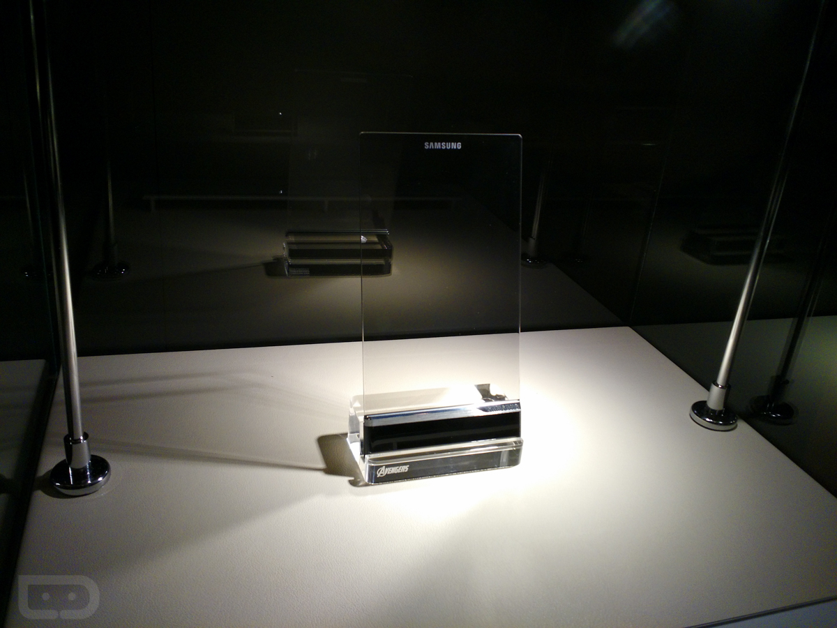
During a press event last night at CES, Samsung showed off new exclusive Avengers: Age of Ultron content that brought out the happy nerds in all of us. They also had life-size statues of Hulk, Iron Man, and Thor that some of us may or may not have posed for pictures with. But outside of the content, we got a behind-glass-case look at some of the specially designed tech that the Avengers team and Tony Stark will use during the film.

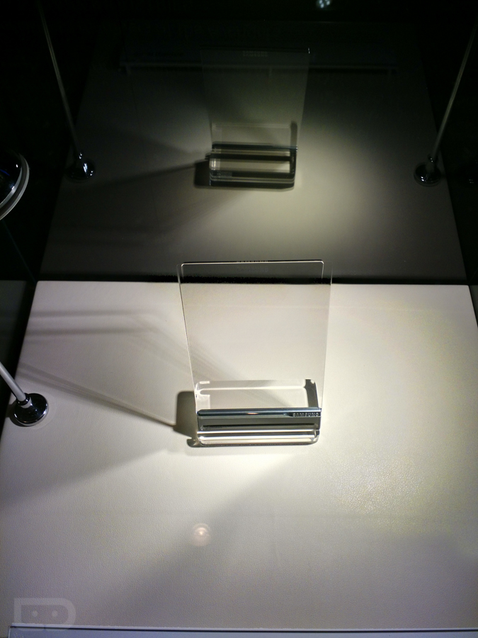
Samsung designed a new smartwatch, Bluetooth ear pieces, and even a concept hologram phone with fingerprint scanner for use in the movie. We took some pictures and have included them below for you to drool over. Obviously, we couldn’t touch the devices or play with them (they aren’t real anyway, so it’s not like they would turn on).

Is it just me or are these some of the sleekest products Samsung has ever designed? Can they hire this design team to make the Galaxy S6?


Here is the Cool Samsung Concept Tech Tony Stark Will Use in Avengers: Age of Ultron

 Nexus line has always represented the very best of Google software for mobile devices, whether it’s on smartphones or tablets. Early in 2014, analysts questioned whether or not Google would discontinue the line in favor of a new, budget line of products that got stock Android into even more hands. Fortunately, we still got at least two more iterations of the Nexus line: the Nexus 6 smartphone and the Nexus 9 tablet.

The Nexus 9 is something of a hybrid of 2013’s Nexus 7 and 2012’s Nexus 10. It runs the newest version of Android and will no doubt influence the future of the platform, but is it a tablet that you should seriously consider next to products like the premium iPad Air 2 or budget-friendly Nvidia Shield Tablet?

Hardware

When I found out that HTC was going to be partnering with Google to produce the Nexus 9, I was legitimately excited for the possibilities. I imagined a thin, full aluminum body with stereo, front-facing speakers that resembled a blown up HTC One M8.

What we got with the Nexus 9 is far more in line with previous iterations of the tablet line and less a HTC-inspired reinvention of itself. It’s a fairly standard black slab that’s modern, but not exactly attention-grabbing. The back of the tablet has the same soft touch plastic that was used on the Nexus 7, except this time we’ve got a black metal frame that runs along the sides of the device. All in all, the design isn’t bad, it’s just a bit forgettable.

In fact, I wouldn’t have a problem with the rather drab look of the device if it the Nexus 9 was a bit more sleek. Instead, however, the Nexus 9 feels strangely thick and heavy in the hand, despite the fact that it weighs in at only 0.94 lbs. It’s lighter overall than both the iPad Air 2 or even the Samsung Tablet S, but it’s also a couple inches smaller, giving it a chunkier feel in the hand. It’s also notably thicker than both those tablets, and also tablets like the Sony Xperia Z2 Tablet and even last year’s iPad Air (by just a tiny bit).

But again, thickness and weight isn’t all that matters. If the Nexus 9 would have had stellar build quality that while it feel like a sturdy tablet that could go with you anywhere, the average feel in the hand wouldn’t have been a problem at all. Instead, the Nexus 9 just doesn’t always the premium build quality that it should. Some users have noted problems with light bleeding in the top right part of display, while others still have complained about defects in the backplate.

While I didn’t have these problems, I did find myself aggravated over the power button and volume rocker, which have so little travel that they barely stick out of the side of the device at all. It’s a big shame, especially considering that there is no other way to wake up the screen other than that one squishy power button. I want to be careful not to exaggerate—the Nexus 9 is still a well-built tablet. It doesn’t creak or feel like a bunch of low-cost pieces put together. However, these small things can become big problems when you’re talking about shelling out $499 for a tablet.

As for what the Nexus 9 does right, there’s plenty. First is the display, which is a beautiful 8.9-inch IPS panel with really nice color reproduction and a decent 281 ppi (pixels per inch) pixel density. The top and bottom bezels are a bit larger all around that I would have preferred, but overall it’s a very nice thing to look at with the display on.

The battery life here is similarly above average. It won’t last as long as the iPad Air 2, but it’ll get you through a full day of heavy use, and probably a few days for the average person.

But most importantly, the Nexus 9 features some great front-facing speakers that once again prove that every smartphone and tablet should have them. They are loud and clear—the one spot where the Nexus 9 easily trumps the iPad Air 2. The Nexus 9’s speakers still aren’t as bright and audible as the HTC One M8’s amazing speakers from the same manufacturer, but they are still the best tablet speakers out there.

Software

While not everything hardware-wise impresses, it couldn’t be a more different situation on the software end of things. The Nexus 9 is the first product to ship with the new Android 5.0 Lollipop installed on it—and it has surpassed all of my expectations. The new version of Android is the biggest change to the look of the operating system at least since Holo, and in my mind, outdoes iOS 8 in many ways.

First off is the notification bar and lock screen, which have both been cleaned up a lot in Lollipop. The notifications are presented as cards that can swiped away or double-tapped to open or act on. My favorite part of the notification bar is the new way you have access your controls such as screen brightness and WiFi. Rather than having to click a tiny button in the top right part of the screen, you can now get to it by just effortlessly pulling down again on the notifications. It’s a tiny little example of the ways that the designers at Google have re-thought the entire experience around fluid gestures intuitive visual cues.

A lot has been said about the new visual flair of Lollipop, but I still find myself loving how the system feels when you interact with it. I love the new app drawer, as well as the new app switcher, which finally feels useful. What Google has done with Material Design is just what Android needed, a perfect balance between intuitivity and ingenuity—the thing the original iOS first accomplished when it was released to the world. It’s a refreshing change from the stark, text-heavy look of iOS 8 or even the cold, rigid feel of Windows 8. It’s colorful, playful, and fun to use without ever feeling cheap or gimmicky, which is quite an accomplishment.

All that being said, Lollipop still doesn’t feel like it’s been properly optimized for tablets. Even the notification bar that I praised earlier still feels a bit weird coming down so narrowly. It’s nothing that holds back the software experience with the Nexus 9, but it does still feel like a missed opportunity without any real multitasking or tablet-only features.

Also, I’d be remiss if I didn’t mention the fact that performance on the Nexus 9 was good, but not perfect. All the animations and proprietary actions feel quick and snappy, but opening apps was still a little slower that I would have liked, and I noticed the system stutter occasionally with heavier apps like Hearthstone.

Verdict

The Nexus 9 feels like a solid update to the Nexus 7. It runs stock Android Lollipop, which has remade itself into the best-designed mobile operating system in the world. The real problem with the Nexus 9 is that it’s priced somewhere between the iPad mini 3 and iPad Air 2—two devices that have an incredibly premium look and feel. The fact that I’d still be much more willing to recommend the $299 iPad mini 2 to most people over this device is telling enough.

The good news for the Nexus 9 is that even if doesn’t quite have the design pedigree or build quality to compete at the $399 price point, neither do many other 9 or 10-inch Android tablets on the market. The 8-inch Nvidia Shield Tablet is our highest recommended Android tablet from 2014, which comes in at a fantastic $299 price point. If you can handle not having Lollipop for awhile, it’s a really good alternative to the Nexus 9.

If Google or HTC could figure out how to put together a killer product that felt as good on the outside as the software experience feels, I’d happily leave my iPad behind for Lollipop alone. But as of now, the Nexus 9 is bound to be a good tablet, but one made only for a small contingency of Android lovers.

Nexus 9 Review: Google Takes on the iPad

Wednesday, December 31, 2014

The Memory Leak Bug Of Lollipop -Android 5.0.1

Android Lollipop – the much anticipated update to Google's OS that brought about that modernistic visual overhaul everyone seems to be craving – the Material Design. But of course, Android 5.0 is more than pretty visuals – there is lots going on under the hood, looking to provide a more stable, smooth, and powerful performance.


Of course, such big new releases are not without faults and no company is safe from launching a dud. As you probably remember, iOS 8.0 caused a lot of headaches for users and Apple alike(especially the 8.0.1 update) , so did iOS 8.1, which was released as soon as the new iPad Airs were announced. This prompted for updates to be released in rapid succession, with some ironing still left to be done.
0.1 updatehas been reported to have a nasty memory leak, which tends to take up 1.3+ GB of RAM, resulting in on-screen apps constantly being force closed and the used phone auto-returning to home screen often. A thread on the Android Issue Tracker forum has been opened and users have reported various Nexus devices to be afflicted , so it appears no one is safe.


Well, Google's Android is also angering early adopters, as the hot-out-of-the-oven      5.
The good news is that the cause of the memory leak may have been pinpointed and the thread has been closed and marked as “FutureRelease”, which means that the fix will be added to an incoming update (which update, and when, is unknown, but we'd imagine – as soon as Android devs can arrange for it to happen).

Android 5.0.1 memory leak discovered, fix under works

The Internet Explorer And Windows 10

Microsoft will launch Windows 10 next year, probably in late summer / early fall. The new iteration of the OS will work on many devices, from smartphones to tablets and PCs, representing a big step forward compared to Windows 8.1 and Windows Phone 8.1- that’s why Microsoft decided to name it Windows 10, eluding the Windows 9 moniker altogether. 
According to ZDNet, one of the major changes that Windows 10 will bring is a brand new browser. 
Currently codenamed Spartan, the browser will still rely on Microsoft's Chakra JavaScript engine and the Trident rendering engine (used by Internet Explorer 11). Even so, ZDNet’s sources have it that this is definitely not Internet Explorer 12, but a new and “lightweight” browser that will be available on desktop computers, tablets, and smartphones. Spartan could resemble Chrome and Firefox more than Internet Explorer as we know it.
Despite the arrival of the new browser, it’s said that Internet Explorer will still ship with Windows 10 (backward compatibility reasons being quoted), so this is not yet the death of IE - though we assume that it is the beginning of the end.
Microsoft will reveal new details about Windows 10 in January (next month), so maybe we’re going to find out more about Spartan then. 
P.S: The image above presents a well-known, humorous take on the fact that Internet 

Windows 10 might be the beginning of the end for Internet Explorer

 
Hi-Tech Talk © 2015 - Designed by Templateism.com